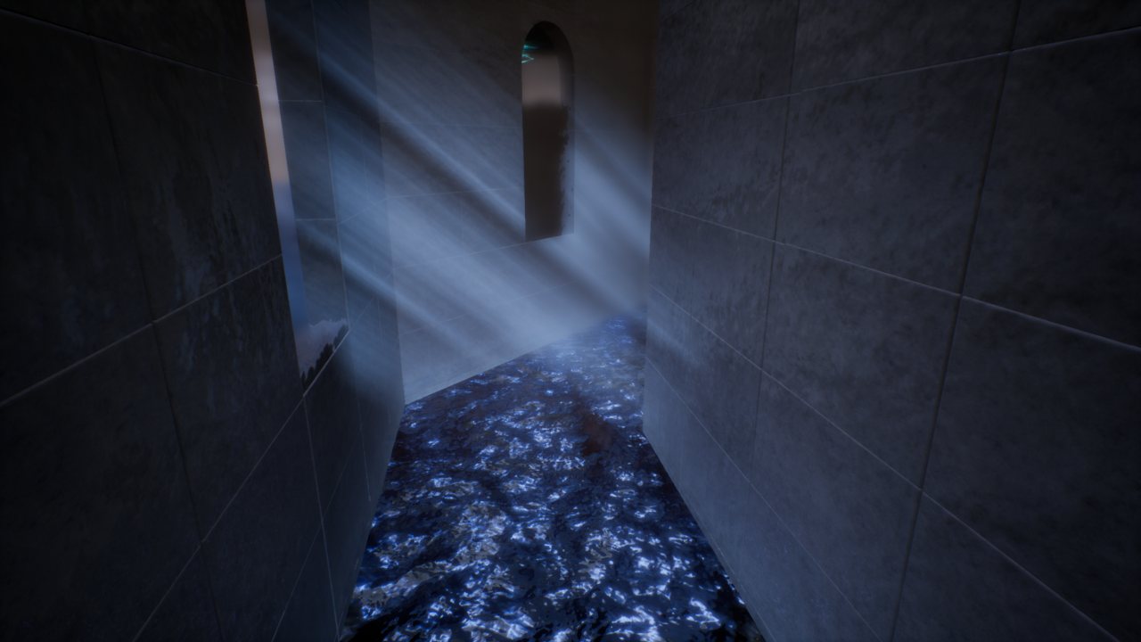
Image Update: Light Shaft
Scenery in 《Drifting : Weight of Feathers》
Steam - Steam Page
Itch.IO - Light Shaft
IndieDB - Light Shaft
UE4 Forum - Light Shaft
Light Shaft
Hello everyone!
In order to achieve a visual aesthetic with low-performance hit, I adopt the practice of using translucent cone or plane mesh to simulate light shaft.
While the result looks great and the shader complexity is low, I've noticed there's always a harsh cut-off at the edge of each mesh - the rays stopped abruptly where the mesh ended - I need to manually hide these meshes under floors or behind walls to avoid breaking the illusion. I've tried using a gradient texture to smooth out the edges, but the cut-off is still noticeable, and tweaking the strength of the gradient affects the brightness of the light shaft meaning extra work to re-calibrate all the previously made light shaft.

(there are still noticeable cut off when the light shaft overlaps with other translucent objects due to sorting priority, that is an issue I'm still working on)
Curious how other developers made their light shaft without harsh cut-off, I made a search online and found a 2015 post in the UE4 community forum. The author demonstrated a beautiful light shaft without a visible cut-off at the edge of the plane. I took a closer look at the shader graph, although the shader is similar to mine, the author uses an ellipse-shaped gradient texture instead of a plain gradient texture. I replaced my gradient texture with the ellipse-shaped one and, surprisingly, all the harsh cut off vanishes!
Here is a BIG THANK YOU to @Rhayader for his wonderful texture and generosity to share it with other developers! ヽ(°▽、°)ノ
Feel free to share your tips and tricks to make the light shaft even better! I hope you enjoy this week's update, have a lovely weekend peko!
Get 《Drifting : Weight of Feathers》
《Drifting : Weight of Feathers》
3rd-person action, fluid animation, versatile movement
| Status | In development |
| Author | rit2040 |
| Genre | Action, Shooter |
| Tags | 3D, Fast-Paced, Female Protagonist, Parkour, Singleplayer, Third-Person Shooter, ue4, Unreal Engine |
| Languages | English |
More posts
- 《Drifting : Weight of Feathers》 Demo Ver 2.9 Now Available!Oct 09, 2021
- New Game Trailer and Dev Live Streaming Coming Soon!Sep 25, 2021
- 《Drifting : Weight of Feathers》 Demo 2.8 Update - New Hairstyle 'Youthful' a...Sep 04, 2021
- 《Drifting : Weight of Feathers》 Demo 2.7 Update - Gamepad Support and Online...Aug 02, 2021
- 《Drifting : Weight of Feathers》 Major Tutorial Overhaul in Ver2.6 UpdateJul 04, 2021
- 《Drifting : Weight of Feathers》 Opening Cinematic - Target EliminatedMay 22, 2021
- 《Drifting : Weight of Feathers》 Demo Ver. 2.1 Major Update!Mar 20, 2021
- 《Drifting : Weight of Feathers》 Played by ArrowSan1999 - A soothing voice an...Feb 07, 2021
- 《飄移 : 羽毛的重量》 2021 台北國際電玩展 新聞資料袋Jan 12, 2021
- 《Drifting : Weight of Feathers》 TpGS 2021 Press KitJan 12, 2021

Leave a comment
Log in with itch.io to leave a comment.